

Complex information does not simplify itself. Someone has to decide what to cut, what to reorder, and how to present what remains to a visitor who arrived with no prior context and limited patience. Global top-rated web design agencies approach this as a structural challenge rather than a writing exercise. Hierarchy decides what appears first. Visual grouping decides what belongs together. The amount of content visible at one moment shapes how much a visitor absorbs before moving on. Each decision reduces effort without the visitor ever noticing it was made.
Chunking aids clarity
Large blocks of unbroken text signal effort before reading begins. Visitors scan the shape of content before committing to it. A wall of text gets skipped. The same information broken into shorter separated sections gets read. Chunking breaks content into units the eye can assess one at a time rather than face as a single dense continuous mass. Three ways professionals apply it:
- Long explanations split into numbered steps so visitors follow one action at a time without holding the full sequence in memory.
- Related details grouped under shared headings so each information cluster has a clear direct entry point.
- Single-idea paragraphs that finish one thought completely before the next one begins.
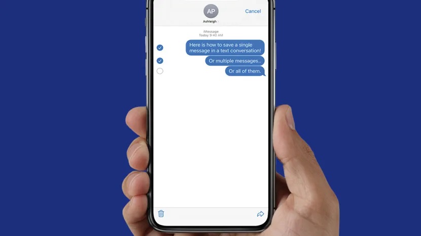
Visuals replace text
Some information communicates faster as an image than as a sentence. A six-step process takes eight lines of text to explain. As a simple diagram it takes seconds to follow. Professionals choose visual formats because certain content types genuinely transmit faster through images than written descriptions of the same material do. Three situations where visuals work harder than text:
- Sequential processes read faster as diagrams than as written instructions placed inside a paragraph.
- Comparisons between items land faster in a table than in sentences where the visitor must hold each point in memory while reading the next.
- Data patterns communicate through a chart faster than a paragraph listing the same numbers.
Hierarchy directs reading
Not all content on a page carries equal weight. Primary messages need to arrive before supporting detail does. Secondary information needs to be accessible without competing for attention with what matters most. Professionals use size, colour weight, and positioning to create a reading order that visitors follow without stopping to assess which section deserves attention first. Pages without clear hierarchy force visitors to make that assessment themselves. Some do. Most do not. Without a visible reading order, attention scatters across the page rather than moving through it in a direction the content supports. A well-constructed hierarchy removes that decision entirely. Visitors arrive at the most important information first because the layout made that outcome inevitable from the start.
Simplifying complex information is not about writing less. It is about presenting what exists in the order and format that gives every visitor the clearest possible path through it. Professionals who get this right produce pages where complexity disappears completely into the reading experience. That invisibility is exactly what good structural thinking looks like from the outside.


Comments